Sunday, April 24, 2011

Portraits

So, I took a couple really good portrait shots of myself and than put my memory card into the wrong slot and can't get it out... Therefore, I am stuck using some of my old photo's for this assignment. I found three different photo's that I really like because they all use different forms of a portrait shot and I see multiple tips used throughout all three of them as well.
This photo is using the rule of thirds. I also like how she is not looking at the camera lens directly kind of gets you wondering what it is her little eyes were caught up on. Her hands are also not clenched and positioned in a way that adds more of a story line to the photograph. Lastly, because I am just a little bit taller than my 22 month old daughter the photo was taken from more of an above angle rather than straight on.
This photo is yet again of my beautiful daughter. I really like how the background is so dark because it brings more focus to her face. She is looking straight into the lens which draws the viewer to her as well. She is not smiling which means her face brings a different emotion to the picture; therefore, her face also brings a different story line. I also think this image captures "catchlights". Her eyes in the photo definitely tell a story all in there own from the flash reflecting off them.
This photo is simple. My subject in this photo was not expecting me to take her picture at that very moment so she was relaxed and the photo is natural. I turned my camera so the picture was rotated and off center. One of her hands is holding a "prop" and she is focused on the prop which gave the viewers a story line. Her other hand is relaxed allowing her fingers to be natural looking and spaced apart. Once again I apologize for the "old" photo's; however, I think the photo's I chose work for this assignment anyways. I am going to attempt to take my tower apart to get my memory card back though...

Saturday, April 2, 2011

Clone, Painted and Text Pics


The first picture is my original. These are just blue stones laid out on a table for decoration. The second is my altered picture and this is what I did to create it. I started off by changing the picture size from 16.7% to 25%. I than made a duplicate layer of the original, selected the clone stamp tool and changed its size setting from 21px to 412px to cover a bigger area. Next, I chose a starting point by pressing the alt button on my keyboard and the left mouse key. I then left clicked diagonally from the top left to the bottom right. I tried this multiple times before finally liking my end result because it kept making a box where the original picture would have ended. Finally I realized what I was doing wrong and cam up with this. I really like this picture because the stones look all neat and organized versus scattered in the original and some of them are darker more transparent than others making it look kind of holographic. 


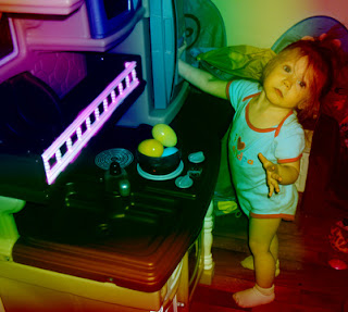
The first is my original and the second is my altered picture. I created this one, once again by changing the size from 16.7% to 25%. Then, I chose the gradient tool and the rainbow color option in the gradient editor. Next, I clicked on the diamond option, set its capacity at 50%, put my cursor in the left hand corner and dragged it to the bottom right corner to apply the color. Finally, I chose the brush tool, changed the size to 50px with an opacity of 75%, changed the foreground color to pink and painted the fencing on her kitchen set  to give the white a little more color. I really like how I used the rule of thirds in this photo as well. The color makes all the dull colors seem so much more fun!


Once again the first picture is my original followed by my altered picture from using Adobe Photoshop. In this picture I changed its size from 16.7% to 25% as well. I selected the text tool, changed the text style to Blackoak Std, regular, size 72pt and chose the color pink (matched her clothes). Then, I chose the text warp option, horizontal, bend 75%, vertical distortion +28% and left the horizontal distortion at 0%. Finally, I cropped the photograph to simply focus on my daughters huge smile. I really like how I bent and distorted the text because it became shaped like a smile. Made me think of Chris Jorday using objects to form his photos; however, instead I used text to form my word.

Saturday, March 26, 2011

Filters

This is my original photo.
This is my edited filter version.

What I did was changed the size from 12.5% to 16.7%. Then I created a new layer and titled it filter1. Then I went up to filter, stylize and selected glowing edges. I changed the edge width from 2 to 4, the edge brightness from 6 to 5 and the smoothness from 5 to 7. I click okay to apply and this is what I got. I really like the colors in this photo. This shirt worked very well with this filter!

This is my second original photo.
This is my second edited filter version.

What I did to this one was changed the size from 16.7% to 25%. I created a new layer and titled it filter2. I then clicked on filter, distort and then chose the filter liquify. I changed the brush size to 10 from 64 so it was smaller and kept the brush pressure at 50. I then liquified their hair, the background (wall and picture) and their clothes. I left their faces alone to give the picture some sort of stillness. I clicked okay to apply and this is what I got.

Dodge and Burn


This is my original photo of two of my friends.


This is my "dodge and burn" photo.

What I did was upped the size from 16.7% to 25%. I created a new layer (titled it dodge and burn), selected the overlay option and checked the fill with overlay neutral color (50% gray) box. After that was all done I selected the brush tool and changed my foreground color to white with a opacity of 10% and a brush size of 693px. I then used the brush to lighten the faces and their teeth. I then changed the foreground color to black with a brush size of 500px to darken the background, their clothes and their blankets. I think this picture stands out now because their faces are glowing!

Friday, March 18, 2011

week 8: lighting and color

This is my original copy. I took this picture on my wedding day of the lake from where we got married.
This is my edited copy. I increased the blue and then lightened it to take away the storm cloud, dreary feel. Then I adjusted the color curves by going up in hightness, brightness, down in midtone contrase and down in shadows. I also increased the hue and saturations.

This is my original copy.
This is my edited copy. I removed the color making it black and white. I brightened the photo a little bit. Increased the shadows a tad, decreased the midtone contrast and increased the highlights. Then I adjusted the hue to 25%. Increased the saturation and brightness. I think That her eyes really stand out now and her features are more clear due to dark outlines.


Wednesday, March 16, 2011

Week 7: Copy using photoshop


The first two pictures are my originals. I just randomly took a picture of my couch and one of my daughters dolls. They were both 16.7% so I did not have to resize them. I then made the duplicate layer of both photos and moved the locked ones to the trash bin.

The first edited picture I used the magnetic lasso tool to outline the doll and place him on the couch. The second edited picture I used the rectangle marquee tool to form a rectangle shape (using the couch) to form the base of a fictional skateboard. Then, I used the magic wand to form the four tires (using the base of the lamp).

I thought it was really neat how the doll looked like a real sized person sitting on the couch due to the same sized photographs (16.7%). I actually fooled around after and made the doll photo smaller to see what it would do and it still made the doll the same size as the photo in which i was placing it on. Weird. I wonder why it does that....


Thursday, March 3, 2011

Landscape Photos

This weeks assignment was challenging. I drove around for an hour looking for the perfect photograph. After a little while I realized that the perfect photograph is simply what you make of it. I chose the five photos I enjoyed the most and they are....


 My intentions while taking these photos was to find something everyday, calming, neutral colors and beautiful. Picture one is a simple fence and trees. The second one is of the frozen lake, with an empty park bench with a beautiful deck and building in the background. Picture three is a winding road with trees. Picture four is a clear blue sky, beautiful blue tinted mountains (from the distance and lighting). Finally picture four is the three islands surrounded by frozen lake, trees and mountains.

Saturday, February 26, 2011

Aesthetics

After researching this topic a bit more I have finally came to my ah-ha! moment. I was reading an article online at http://www.luminous-landscape.com/columns/aesthetics-1.shtml. In this article i was surprised to find out how in depth aesthetics actually is. I couldn't believe there were NINE steps to this one word. I use to look at professional photographs and think "whats so hard about snapping a few photographs of one image and then picking the best one?" After the last few weeks of this class and reading over the nine steps to taking a beautiful photograph I have realized that photography is not that easy. You have to be able to relate to all nine steps as listed in the online site I mentioned...

  1. How to see photographically
  2. How to compose a photograph
  3. How to choose the best lens for a specific composition
  4. How to find the best light for a specificphotograph
  5. How to chose the best "film" for a specific image
  6. How to determine the best exposure for a specific scene
  7. How to decide which ones are "keepers" and which are not
  8. How to assemble a body of work
  9. How to establish a specif photographic style
This was an ah-ha! moment for me because I really could not believe all the effort one must put into a photo and how much knowledge they should possess in order to take the perfect picture.

Wednesday, February 16, 2011

Monochromatic, Analogous & Complimentary Pictures

I really enjoyed this weeks assignment dealing with colors. I had so much fun in fact that I took pictures of all the options (monochromatic, analogous, and complentary) even though we were only asked to choose two.

Monochromatic: One hue (color). This photo is taken through the bottom of a green glass that is set on a white table cloth. My Sony Cyber-Shot camera was on the twilight portrait setting (shoots portraits in low light with flash). I tried this picture in a variety of settings but this one cameout the best. I really like the all "green" affect the glass had.

Analogous: Three colors in which are next to one another on the color wheel. As you can see I chose to photograph a red, orange and yellow pepper with a black background. My camera was set on the soft snap setting (shoots subject with soft background and flash). As all of you already know when red and yellow are combined in equal amounts they create the color orange; therefore, red, yellow and orange are in a group on the color wheel. I tried this photograph with a white background and in different positions/angles; however, I really enjoyed the colors and textures in the one I chose to share.
Complementary: Two colors in which are opposite of each other on the color wheel. I chose the colors red and green in the photograph above. As you can see there are red roses, green stem/leaves, green marbles and the basket has red and green stripes. I believe the white background makes the red richer and the green still stand out. My camera was set to auto mode with flash. I aslo took many shots of these objects. I tried the vase outside the basket (but the flowers didnt stand out as much) and I tried the basket on its side with the vase inbetween the stripes of red and green but the picture contained too much white background for my liking.

Friday, February 11, 2011

Week 3: Collage

While my camera was in "macro" mode, I ventured through my mother's house snapping photo's of some of her belongings. I used different settings, for different photographs as well. Some of the settings included: Snow (shoot whitish scene with high brightness), Twilight Portrait (shoots portraits in low light with flash), Auto and Soft Snap (shoot subject with soft background).There is a photo of a crystal egg, flowers from the top, side and bottom, a vase, a crystal sculpture (my favorite picture because shadow forms the object due to the white on white contrast), a olf kettle, a fake tree, dead flowers, a wooden cross, sand, candle, glass, window with shades, a fan, a cat, my daughter, fireplace tools and chinese statues.


A Day In The Home Of The Brousseau's


Monday, February 7, 2011

Cold Wonder

 Photo 1: I took this photo from at an angle from a distance to capture the entire scene.
 Photo 2: I took this photo in zoom mode to allow you to see what the entire scene was made up of, up close.

I took several shots of these branches with these icicles on them and these were my
two favorite out of the bunch! I was unable to do the shots I wanted to due to the 10inches of snow that came the night before I took them; however, I believe these two capture the scene perfectly!