Saturday, April 2, 2011
Clone, Painted and Text Pics
The first picture is my original. These are just blue stones laid out on a table for decoration. The second is my altered picture and this is what I did to create it. I started off by changing the picture size from 16.7% to 25%. I than made a duplicate layer of the original, selected the clone stamp tool and changed its size setting from 21px to 412px to cover a bigger area. Next, I chose a starting point by pressing the alt button on my keyboard and the left mouse key. I then left clicked diagonally from the top left to the bottom right. I tried this multiple times before finally liking my end result because it kept making a box where the original picture would have ended. Finally I realized what I was doing wrong and cam up with this. I really like this picture because the stones look all neat and organized versus scattered in the original and some of them are darker more transparent than others making it look kind of holographic.
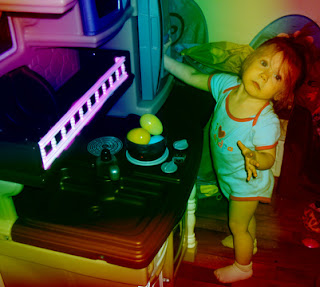
The first is my original and the second is my altered picture. I created this one, once again by changing the size from 16.7% to 25%. Then, I chose the gradient tool and the rainbow color option in the gradient editor. Next, I clicked on the diamond option, set its capacity at 50%, put my cursor in the left hand corner and dragged it to the bottom right corner to apply the color. Finally, I chose the brush tool, changed the size to 50px with an opacity of 75%, changed the foreground color to pink and painted the fencing on her kitchen set to give the white a little more color. I really like how I used the rule of thirds in this photo as well. The color makes all the dull colors seem so much more fun!
Once again the first picture is my original followed by my altered picture from using Adobe Photoshop. In this picture I changed its size from 16.7% to 25% as well. I selected the text tool, changed the text style to Blackoak Std, regular, size 72pt and chose the color pink (matched her clothes). Then, I chose the text warp option, horizontal, bend 75%, vertical distortion +28% and left the horizontal distortion at 0%. Finally, I cropped the photograph to simply focus on my daughters huge smile. I really like how I bent and distorted the text because it became shaped like a smile. Made me think of Chris Jorday using objects to form his photos; however, instead I used text to form my word.
Subscribe to:
Post Comments (Atom)


That text wrap is fun, isn't it? Nice work this week, Amanda, you seem to understand these tools well. You might want to experiment with using the clone too to remove stuff too, that's a great use for it (like telephone poles, stray shapes or items that distract from the subject).
ReplyDeleteI love the first image. I'm still puzzling over how exactly you got it to look like you did with the process you used. I'm going to have to go play with my own now!
ReplyDeleteYour daughter is sooo cute! Perfect text insert of SMILE! The first image is really cool! I too am stumped!
ReplyDelete